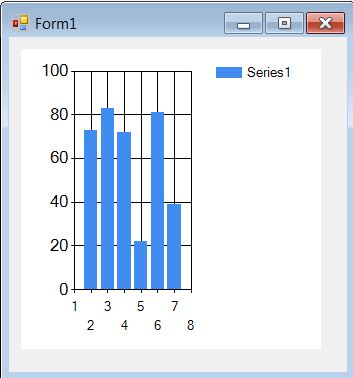
Test and Measurement applications often require display of data in a graphical format and T&M engineers are familiar with display elements called “charts” and “graphs”. These are everywhere from instrument displays to software GUIs. So when it’s time to use C# to create a custom application, one expects nice and easy to use display elements, but at the first look, these are nowhere to be found. There is this element called ‘Chart’ but it seems to have a histogram display and that isn’t exactly what you’re looking for.
Well, the graphs and charts very much exist but require some changes to get them to work as generic “graphs” and “charts” we are familiar with.
While the built in charts may serve the purpose, it is also possible to use third party libraries like OxyPlot to get relatively easy to use and highly customizable graphs, charts and other display elements. We discuss how to use the OxyPlot library in another post, here.
This article shows how to use the native ‘Chart’ display within the .NET framework. We use a very simple example and feed a set of X and Y values to a chart. Once you know how to do that, it’s easy to extend it to input any data to it as long as you have it in the right format. There are a few initial steps required to set up the chart to accept X,Y values.
We start by creating a new Windows Forms Application.
Next we add a Chart element to the form. It can be found under Data category in the toolbox

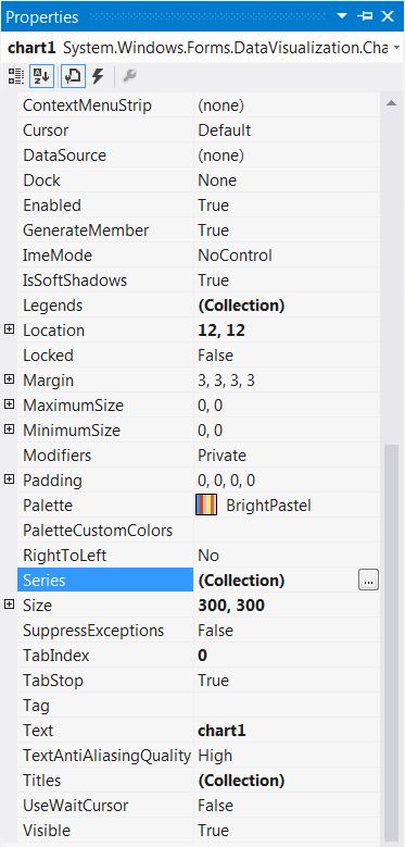
Once that is done, we need to change the properties of the Chart element
Under Chart properties, go to the Series section and click on the small button next to the collection setting:
In the settings window that pops up, make the following two changes:
– Change the ‘ChartType’ property to ‘Line’. By default it is set to ‘Column’ and that’s the reason why the Chart showed Histogram kind of a display.

As soon as you make this change, you will observe that the display looks more like a line chart.

– In the same collection editor window under the ‘Data’ category, add a name (such as SeriesData). We will use this name to refer to the series and add data to the plot.

That’s pretty much it from configuration point of view. We can now start adding the code to send plot data to the chart.
Let’s add a button and format the GUI a little.

We’ll now add a very simple code to the ‘Plot Data’ button’s click even handler:
private void button1_Click(object sender, EventArgs e)
        {
            //Create a data set to feed to the chart
            double[] DataArray = new double[] {1, 2, 3, 5, 4, 3, 2, 1 };

            for(int i = 0; i< DataArray.GetLength(0) ; i++)
            {
                //send X and Y data points to the chart
                chart1.Series["SeriesData"].Points.AddXY(i, DataArray[i]);
            }
        }
Note the following line and how we refer to the plot series as ‘SeriesData’, same as what we set in the configuration window.
chart1.Series["SeriesData"].Points.AddXY(i, DataArray[i]);
Rest of it is fairly straightforward, we call the AddXY method and feed in the X and Y data values.
Let’s go ahead and run the code:

On clicking the Plot Data button, the chart display is updated:

The results are not exactly breathtaking but it gets the job done; the data is plotted in an expected manner on the chart.
Now can we add another plot to the chart and display it along side the previous plot? Of course!
Simply add another Plot Series, change the type to ‘Line’ and set a name for it:

The default form display updates to show the new plot line:

Let’s add another set of data points to the Button event handler
        private void button1_Click(object sender, EventArgs e)
        {
            //Create a data set to feed to the chart
            double[] DataArray = new double[] {1, 2, 3, 5, 4, 3, 2, 1 };
            double[] DataArray2 = new double[] { 1, 5, 1, 5, 1, 5, 1, 5 };

            for(int i = 0; i< DataArray.GetLength(0) ; i++)
            {
                //send X and Y data points to the chart
                chart1.Series["SeriesData"].Points.AddXY(i, DataArray[i]);
                chart1.Series["Series2Data"].Points.AddXY(i, DataArray2[i]);
            }
        }
On running the application, the chart now shows two plots side by side.

Also see: Charts and Graph using OxyPlot and generation and plotting of common waveforms such as Sine, Square, Triangle etc.

I enjoy your ideas that everybody can relate to.
Hello! Would you mind if I share your blog with my facebook group?
There’s a lot of folks that I think would really enjoy your content.
Please let me know. Cheers
Great article. I am experiencing a few of these issues
as well..
Appreciation to my father who shared with me concerning this website, this weblog is genuinely awesome.
Hey there! I realize this is somewhat off-topic however
I had to ask. Does managing a well-established website
such as yours require a large amount of work? I’m completely new to writing a
blog however I do write in my diary on a daily basis.
I’d like to start a blog so I will be able to share my
experience and thoughts online. Please let me know if you have any kind
of suggestions or tips for new aspiring blog owners. Thankyou!